Scientific Poster Guidance
A scientific poster is an opportunity to present a concise summary of your research in an aesthetically pleasing and colourful format. Creating a well-designed poster takes time, so start early and plan accordingly.
Planning Your Design
Keep the following in mind when planning your presentation:
- Requirements – Read the specific module activity guidelines carefully.
- Aims – Define what you want to communicate.
- Audience – Consider who will be viewing your poster and tailor your design accordingly.
Example poster: Leadership In Healthcare Scientific Poster Module Activity.
For further guidance, watch this short video (4 minutes).
We recommend creating your poster in a Microsoft PowerPoint slide. Mac users may find Keynote useful. A free, web-based version of PowerPoint is available online. You are also welcome to use alternatives such as Canva or Adobe Express; please make sure you download your poster as a PDF file that has not been flattened.
Design your poster at A0 size (84.1 x 118.9 cm / 46.8 x 33.1 in), in either landscape or portrait orientation. In PowerPoint, adjust this via Design → Slide Size → Custom Slide Size.
Ensure your software settings are correct from the start to prevent quality loss when resizing.
The final file must be uploaded to Moodle as a PDF (.pdf).
Structure
Scientific posters tend to follow a typical format (depending on the research methods used). This supports the reader in scanning the poster for the most important piece of information. Below are some guidelines on how you should put your posters together:
Characteristics of a Scientific Poster
- Organised, clean, simple design.
- Focused on one specific research topic that can be explained in 5-15 minutes.
- Contains a Title, Authors, Abstract, Introduction, Materials & Methods, Results, Discussion, References and Acknowledgements.
- Has four to ten high-resolution figures and/or tables that describe the research in detail.
- Contains minimal text, with figures and tables being the main focus.
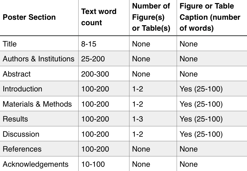
Here are some recommendations for the number of words to use for each section:
NOTE - This assumes a word count of 1000 words. If your module activity is less than 1000 words, please halve all of these numbers.

https://ohiostate.pressbooks.pub/scientificposterguide/chapter/scientific-posters/
Text
- Keep information clear and concise.
- Unless otherwise stated in the module activity, aim for ~500 words (excluding references).
- Choose a short, engaging title.
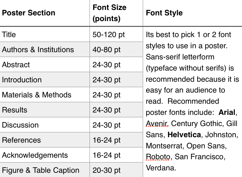
- Use an easy-to-read font and limit font variations.
- Ensure text is large enough to be readable from a distance.
- Break up large text blocks using subheadings, bullet points, and lists.
- Maintain clarity and readability for your target audience.
- Include references on a separate page.

https://ohiostate.pressbooks.pub/scientificposterguide/chapter/scientific-posters/
Images and Graphs
| RULE 1: Content is the most important part of your poster. |
| RULE 2: Visuals should enhance, not distract from, your poster. |
- Relevance – Use images that directly support your content.
- Size – Ensure the main subject of the image is clear.
- Resolution – Use high-resolution images and test quality by zooming in.
- Referencing – Cite all images and tables appropriately.
Graph and Chart Guidelines
- Provide a short but clear heading.
- Label axes clearly.
- Use a simple, easy-to-read graph style.
- Avoid unnecessary gridlines.
- Ensure plot lines are distinct and readable.
Marking Rubric
| Grade | Knowledge & Understanding | Analysis & Reasoning | Synthesis | Visual Communication |
|---|---|---|---|---|
| Distinction | Demonstrates extensive, systematic knowledge of topic. | Sophisticated analysis and confident use of appropriate analytical frameworks. | Original approach to task with excellent integration of multiple evidence sources. Clear audience-centred practical application. |
Excellent visual clarity and professional finish with innovative use of graphics/tables. Excellent use of space and colour. |
| Merit | Demonstrates comprehensive knowledge of the topic. | Consistent analytical approach with good use of appropriate frameworks. | Some innovative elements to approach with good integration of evidence. Clear audience-centred practical application. |
Very good visual presentation with effective use of graphics/tables. Appropriate use of space and colour. |
| Pass | Demonstrates sound knowledge of core concepts. | Adequate analysis of key issues/concepts. | Standard approach with basic integration of evidence. Appropriate audience-centred practical application. |
Adequate visual presentation with appropriate use of graphics and tables. Acceptable use of space and colour. |
| Fail | Limited knowledge of the topic with gaps in understanding. | Limited or poor analysis, missing key issues/concepts. | Inappropriate approach to task with limited integration of evidence. Weak practical application or not appropriate for the audience. |
Poor visual presentation with ineffective use of graphics and tables. Imbalanced elements. |